Too often people tend to think that UX is just art: Flat design, Modern UI and animations… But art represents only a tiny part of the User Experience. Some developers go one step further and think that it also implies strong technical skills (to achieve a good performance, proper-functioning software, etc). However, that is still a very narrow perspective of User / Customer Experience.

Some of us have realized that UX is not just how beautiful our product looks or how amazing its performance is. There are several other fields that are crucial when trying to achieve a great experience for our users, as you will see in this post. And if I had to choose just one field that is definitely key to UX, it would be Psychology.
User Experience and feelings
User Experience is all about feelings. A beautiful interface will trigger interest and catch attention. But, what happens once a beautiful interface has catched user’s attention? The user will keep looking around, interacting with our site or product. At this stage, if the user does not manage to use it properly, she will lose interest, no matter the fancy animations and the great performance.
Usability is sometimes an enemy of art. Underlining a link could be hard to accept for a designer, but it is proved that users look for an underlined text when they are looking for a link. By not underlining links, designers could worsen user’s experience. Actually, what usability is all about is sticking to the standards and making things as clear and easy to use as possible.
However, when we talk about Customer Experience there is another key element to take into account. Since you want your visitor to buy something, your purpose is to guide her experience to a particular action. So, apart from design, engineering and usability; there is another key element which is vital in this case: copywriting.
Copywriting has a huge impact in User Experience
It could sound obvious, but 90% of the web is text. When a user is engaged with a nice-looking site that works properly, she will try to perform several actions. By this time, our site has to be usable, but above all, our site must guide her to perform the actions we want her to perform (such as signing up). And we have to tell her what to do and why, usually via text.
In a Landing page this type of text is obviously related to marketing, but once the user has become a customer and is using our product, choosing the right text is just about psychology. We are trying to help our users to perform tasks using our product with the less pain possible; so they don’t get frustrated and they enjoy the experience as much as possible.
Whether it is in a Landing Page or in an actual Product, copy has a huge impact on User’s Experience. However, designers and developers tend to underestimate the importance of text.
But… How can we know if a particular text is better than another? Well, let your users tell you. Tracking user actions, measuring and testing are also key elements to achieve a great UX.
Our experiment: Changing text in the sign-up form
Fortunately, in Vocabulary Notebook we have used Web Analytics and A/B Tests extensively, so we can prove the importance of copywriting in User Experience (and in conversions) by means of one of our experiments.
Sign up page: Old version
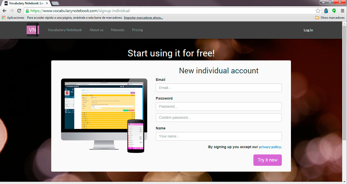
This screen used to be our sign-up page for Vocabulary Notebook. As you can see, the page was quite simple. There is a navigation bar on top, a title and a form with its confirmation button.
The main title was making it clear that you could start using our platform for free. Moreover, the purpose of the secondary title was to remind you that you were about to create a new individual account. Below, a form with three fields: email, password and name. Finally, there was a call-to-action button at the bottom-right corner just saying “try it now”.
We used to think that this version was pretty simple and clear. However, there was a lot of room for improvement.
With this version, our conversion rate (percentage of visitors to our landing page that were becoming registered users) used to be around 3,26%. However, there are some previous steps to get to this page, so if we focus only on those users were arriving to this sign-up page, our analytics say that 63% of them was completing and submitting the sign-up form.
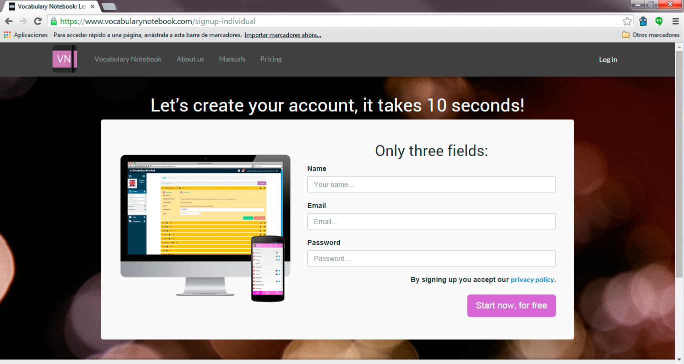
Sign up page: New version
Simple changes, right? Well, I can tell that our users have found those changes to be big enough to make a significant difference in our metrics.
The first change is related to the main title. We decided to move the spotlight from the concept “free” to “it’s real quick”. It is well known that many users get scared when they see a sign-up form. It is a barrier to entry for them. However, removing the sign up was not an option for us, so we focused on trying to convince them by saying that the sign-up process was going be over very quickly.
In this main title we also mention that you will be creating your “personal account”, so there was no need to keep that information in the secondary title anymore. Thus, we decided to also use this secondary title to encourage users to fill the form, focusing on how short it is: “only three fields”.
As you can see, we also made two changes in the form itself. We decided to move the email to the second place, since we had the impression that people are more likely to provide an email than a password at that stage. Apart from moving the password request to the third place, we decided to remove the verification. We provide a “forgot your password” option for recovery, so there is no need to make the form longer with that verification. Finally, we decided to make the CTA (call-to-action) stronger, to convince you to keep going. That is why not only we let you know that by clicking it you can “start now”, but we also remind you that it will be ”free” (at least for now).
The results
Now that you have seen the changes we made, you may be thinking that they are minor and that there shouldn’t be a big difference, since we just changed some text. However, you should already be aware of the importance of copywriting in UX.
Believe it or not, the new version has a conversion rate around 4,10% (percentage of visitors to our landing page becoming registered users). This means that conversion rate increased by 26% (from 3,26% to 4,10%), which I consider a huge increase given the “minor changes” we made.
Taking into account only the users that were actually arriving to the sign-up page, the rate went from 63% of them filling the form in the old version, to 80% of them in the new version; which is a significant improvement.
Since the sign-up form is the last step in our conversion funnel, this change does not have further consequences along the funnel. However, doing small changes in previous stages of the funnel can have a much bigger impact on conversions. In a future post I will describe another experiment we conducted where we optimized a previous step in the conversion funnel. It was also a small detail, but a small improvement in conversions at the beginning of the funnel has much bigger consequences than at the end of it, as we will see. For now, I can only say that after this other change we increased conversions from the 4,10% (rate mentioned above as the result of this experiment), to a 6,74%, which is our current conversion rate for individual users visiting our landing page. If you are curious about this other experiment, stay tuned! I will post about it soon.
In summary, UX is a complex discipline where several knowledge areas merge. Sometimes, trying to improve User Experience we make big changes that involve design, animations, performance… Changes that may take days of work. However, we should not forget the importance of copywriting. It could improve UX significantly with much less effort.
As Jeff Gothelf states “copywriting could be considered the secret weapon of UX”.